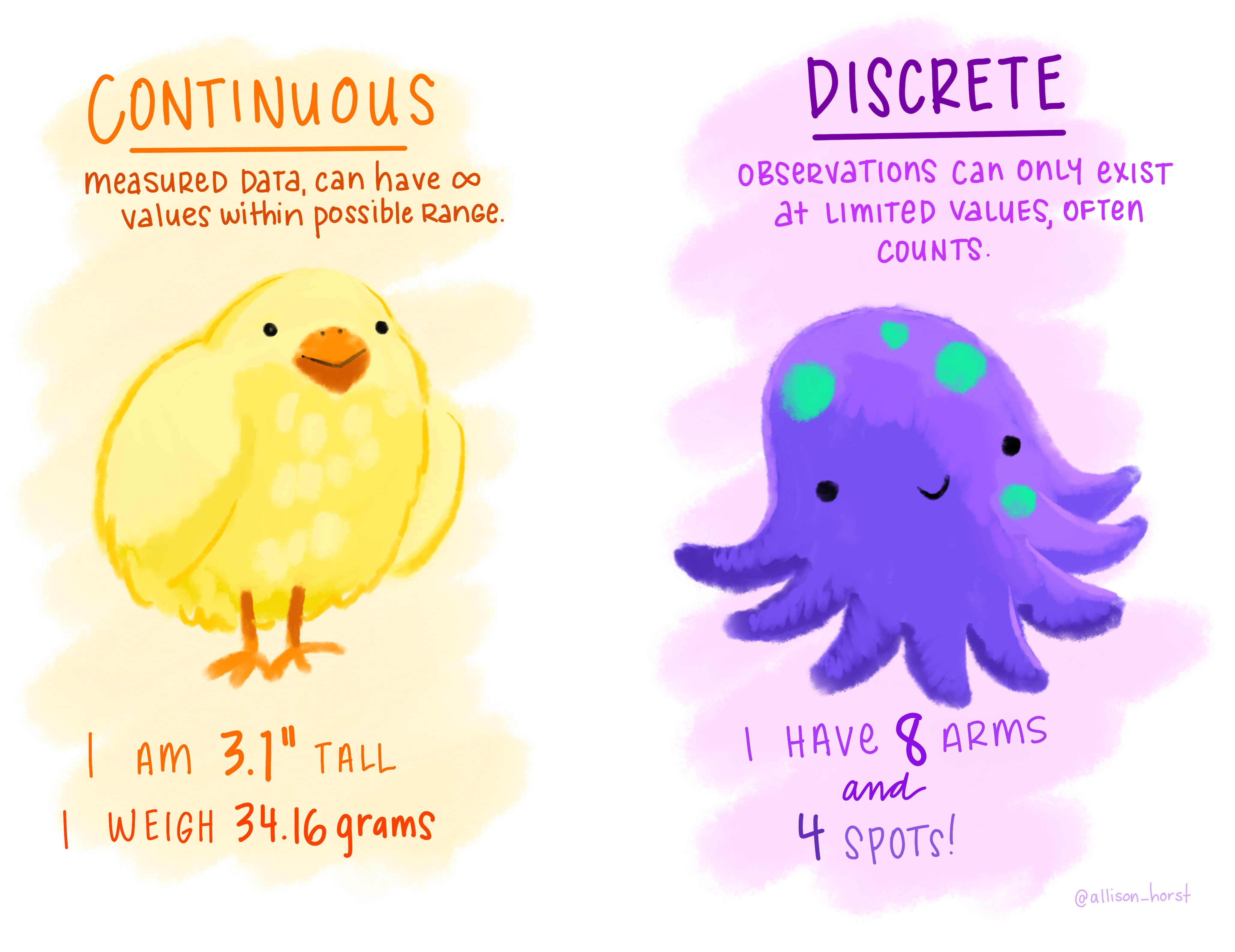
Continuous: measured values, variable can take any value within a range
Discrete: variable only takes limted values (e.g. counts)
Qualitative
Descriptions (usually words)
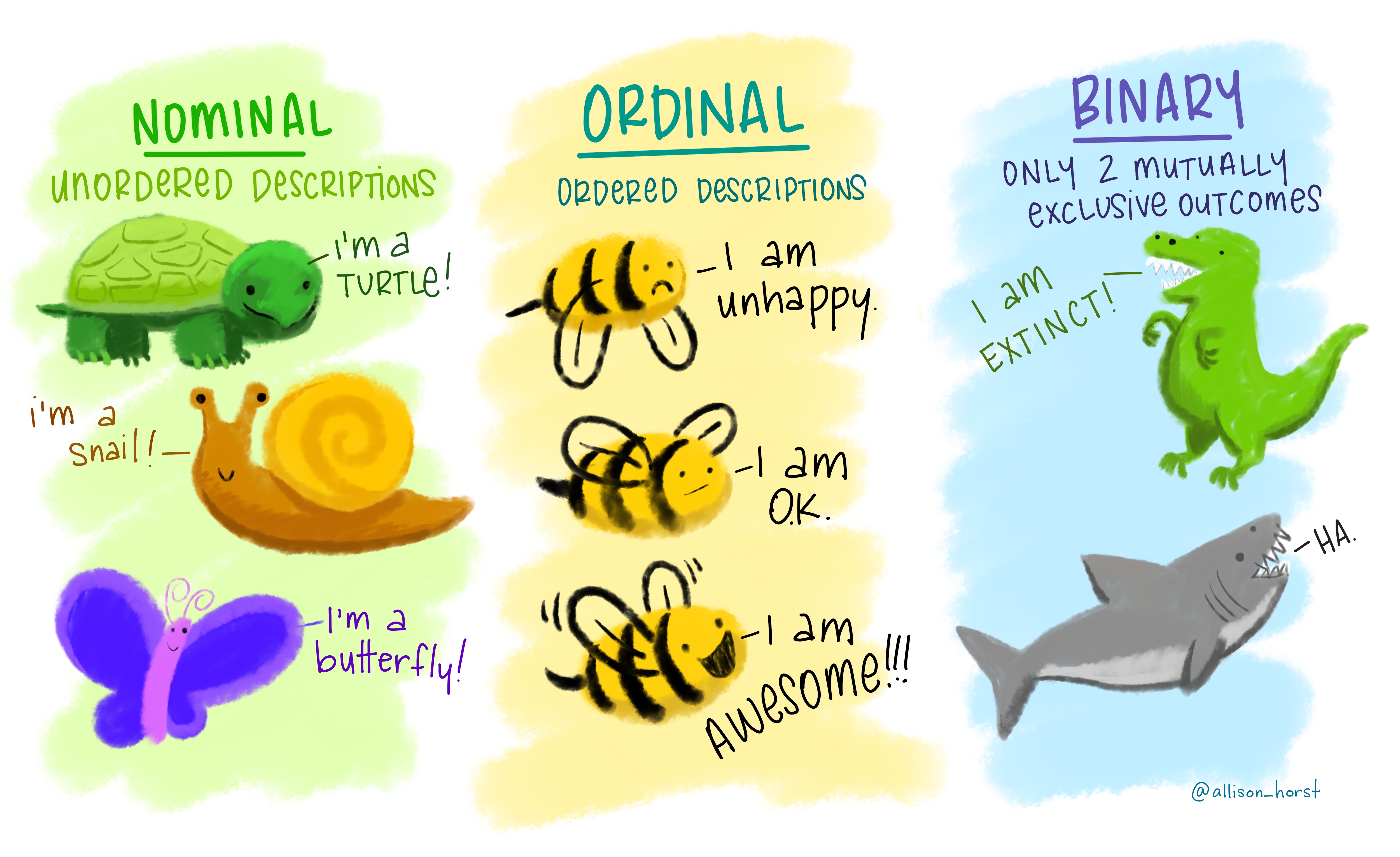
Nominal: order does not matter (classes or categories)
Ordinal: order matters, but the difference between values isn’t known or equal (e.g. Likert Scale)
Binary: only two possible outcomes (yes/no, true/false, 1/0)
Quantitative data: continuous & discrete
Nominal, ordinal, binary data:
Exercise
✏️ For each of the scenarios, identify which are the dependent and independent variables, what type of variable is each one of them (quant/qual/binary/nominal/ordinal/discerete/continuous).
A team studying nutrient runoff wants to know whether an agricultural watershed will exceed or stay below the regulatory nitrogen threshold in a given month. They collect data on 45 watersheds. For each watershed they have recorded whether the nitrogen threshold was exceeded or not exceeded, fertilizer application rate (kg N/ha), percent agricultural land cover, and average monthly rainfall.
We are interested in predicting the number of air quality complaints filed in 2025 in low-income urban neighborhoods. We collect data for 60 neighborhoods over 2025. For each neighborhood we record number of complaints filed in the year, median household income, distance to the nearest industrial facility, type of nearest industrial facility (chemical plant, manufacturing, power plant), percentage of residents who are renters, and local particulate matter (PM2.5) concentration.
Exercise A: Solution
A team studying nutrient runoff wants to know whether an agricultural watershed will exceed or stay below the regulatory nitrogen threshold in a given month. They collect data on 45 watersheds. For each watershed they have recorded whether the nitrogen threshold was exceeded or not exceeded, fertilizer application rate (kg N/ha), percent agricultural land cover, and average monthly rainfall.
✏️
Exercise A: Solution
A team studying nutrient runoff wants to know whether an agricultural watershed will exceed or stay below the regulatory nitrogen threshold in a given month. They collect data on 45 watersheds. For each watershed they have recorded whether the nitrogen threshold was exceeded or not exceeded, fertilizer application rate (kg N/ha), percent agricultural land cover, and average monthly rainfall.
% agricultural land cover: quantitative, continuous
Monthly rainfall: quantitative, continuous
Exercise B: Solution
We are interested in predicting the number of air quality complaints filed in 2025 in low-income urban neighborhoods. We collect data for 60 neighborhoods over 2025. For each neighborhood we record number of complaints filed in the year, median household income, distance to the nearest industrial facility, type of nearest industrial facility (chemical plant, manufacturing, power plant), percentage of residents who are renters, and local particulate matter (PM2.5) concentration.
✏️
Exercise B: Solution
We are interested in predicting the number of air quality complaints filed in 2025 in low-income urban neighborhoods. We collect data for 60 neighborhoods over 2025. For each neighborhood we record number of complaints filed in the year, median household income, distance to the nearest industrial facility, type of nearest industrial facility (chemical plant, manufacturing, power plant), percentage of residents who are renters, and local particulate matter (PM2.5) concentration.
Dependent variable: number of complaints filed: quantitative, discrete
Independent variables:
Median household income: quantitative, continuous
Distance to nearest industrial facility: quantitative, continuous
Type of nearest industrial facility: qualitative, nominal
% residents who are renters: quantitative, continuous
PM2.5 concentration: quantitative, continuous
Basic data visualizations
How can we describe how data are distributed?
Our starting points:
Shape / patterns / clusters (data vizualization)
Central tendency (mean / median)
Spread (standard deviation)
Uncertainty (SO IMPORTANT, but later)
Useful data visualizations
Basic ones:
Scatterplots
Histograms
Boxplots
Scatterplots
✏️
Scatterplots
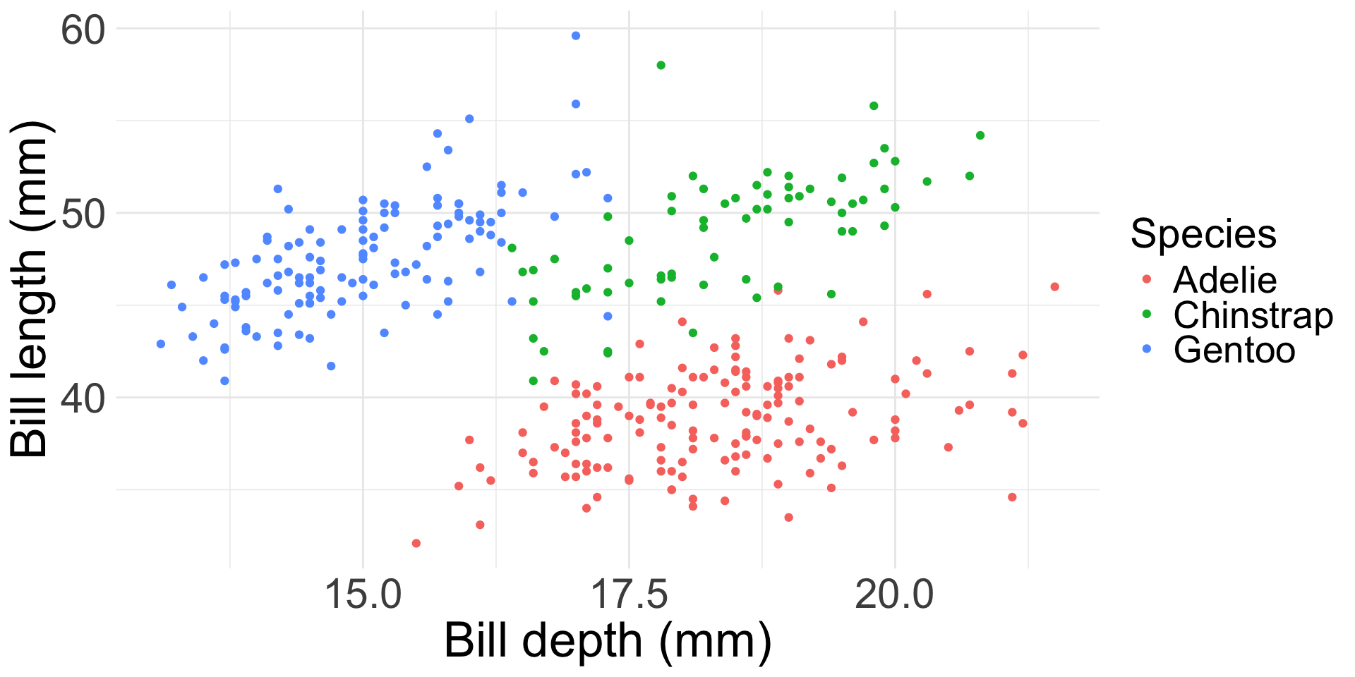
A scatterplot shows the relationship between two numeric variables: each observation becomes a point, positioned using its value on the \(x\)-axis and its value on the \(y\)-axis. A third (categorical) variable can be mapped to color or shape.
Always, always, always look at your data. It is the only way to make a responsible decision about an appropriate type of analysis.
Histogram
✏️
Histogram
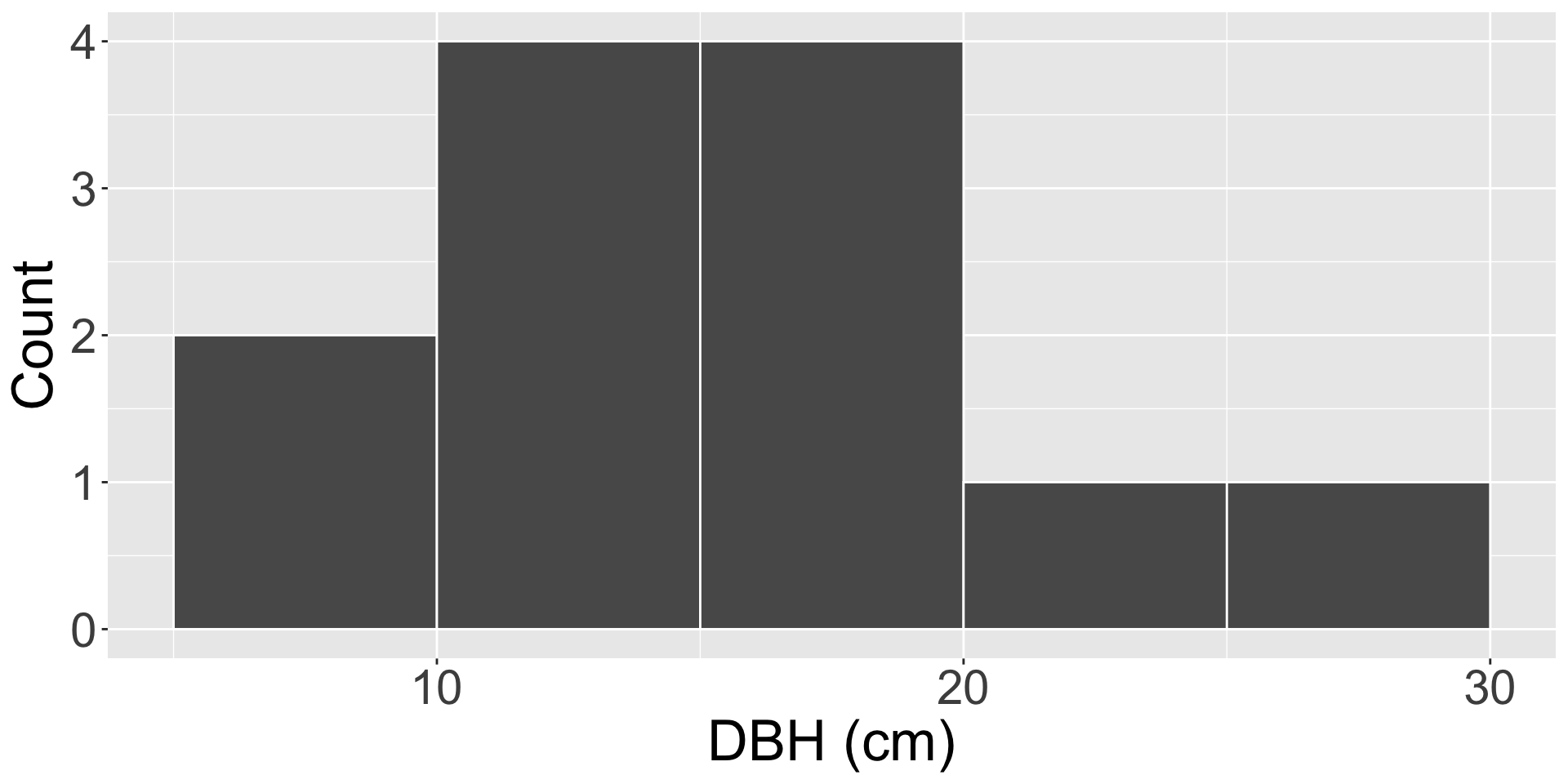
A histogram shows the distribution of a single numeric variable, by grouping values into bins and counting observations.
To construct one:
Divide the range of the data into equal-width bins
Count how many observations fall into each bin
Draw a bar over each bin, with height equal to that count
Histogram example
Twelve trees are measured in a forest plot, giving these diameter at breast height (DBH) values, in cm:
8, 9, 11, 12, 12, 14, 15, 15, 16, 19, 22, 27
✏️
Histogram example
Twelve trees are measured in a forest plot, giving these diameter at breast height (DBH) values, in cm:
8, 9, 11, 12, 12, 14, 15, 15, 16, 19, 22, 27
Using bins of width 5 cm:
Bin (cm)
Count
[0, 5)
0
[5, 10)
2
[10, 15)
4
[15, 20)
4
[20, 25)
1
[25, 30)
1
Exercise
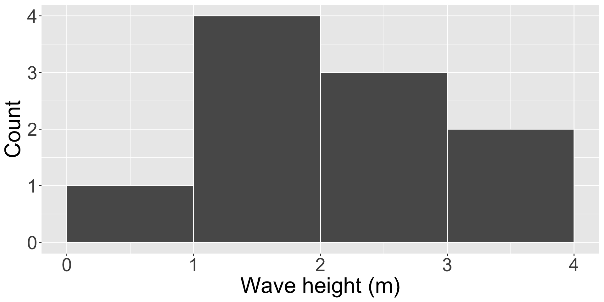
✏️ Ten storm events produced these wave heights, in meters. Using bins of width 1 m (starting at 0), tally the counts and sketch the resulting histogram.
0.8, 1.1, 1.2, 1.5, 1.9, 2.0, 2.4, 2.6, 3.1, 3.6
Exercise: solution
✏️ Ten storm events produced these wave heights, in meters. Using bins of width 1 m (starting at 0), tally the counts and sketch the resulting histogram.
0.8, 1.1, 1.2, 1.5, 1.9, 2.0, 2.4, 2.6, 3.1, 3.6
Bin (m)
Count
[0, 1)
1
[1, 2)
4
[2, 3)
3
[3, 4)
2
Quartiles
✏️
Quartiles
Quartiles divide an ordered dataset into four equal parts.
\(Q_1\) (1st quartile): 25% of values fall below this point
\(Q_2\) (2nd quartile): the median: 50% of values fall below this point
\(Q_3\) (3rd quartile): 75% of values fall below this point
One simple way to find them:
Order the data and find the median (\(Q_2\)): this splits the data into a lower half and an upper half. If there’s an even number of elements, take the average between the two “middle ones”.
\(Q_1\) = median of the lower half
\(Q_3\) = median of the upper half
Quartiles
\(Q_1\) (1st quartile): 25% of values fall below this point
\(Q_2\) (2nd quartile): the median: 50% of values fall below this point
\(Q_3\) (3rd quartile): 75% of values fall below this point
✏️ Find \(Q_1, Q_2,\) and \(Q_3\) for the values 4, 16, 8, 40, 2, 14, 6, 10, 12
Quartiles: solution
\(Q_1\) (1st quartile): 25% of values fall below this point
\(Q_2\) (2nd quartile): the median: 50% of values fall below this point
\(Q_3\) (3rd quartile): 75% of values fall below this point
💡 Let’s see a solution!
Find \(Q_1, Q_2,\) and \(Q_3\) for the values 4, 16, 8, 40, 2, 14, 6, 10, 12
Ordered: 2, 4, 6, 8, 10, 12, 14, 16, 40
\(Q_2\) (median): 10
Lower half: 2, 4, 6, 8: an even number of values, so \(Q_1\) is the average of the middle two: \(Q_1 = \frac{4+6}{2} = 5\)
Upper half: 12, 14, 16, 40: again an even number of values: \(Q_3 = \frac{14+16}{2} = 15\)
Boxplot
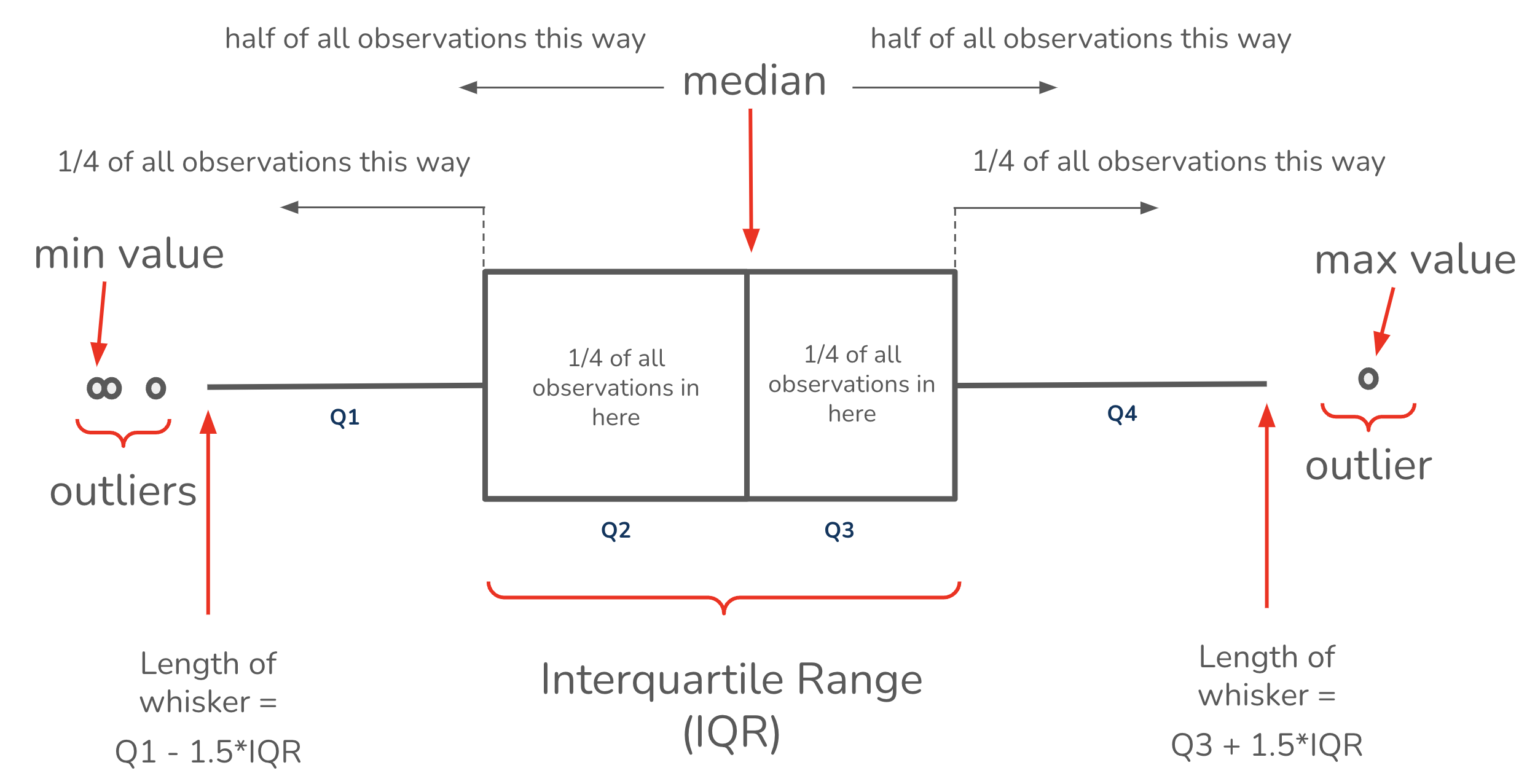
How it’s drawn:
Draw a box from \(Q_1\) to \(Q_3\): this box spans the interquartile range: \[IQR = Q_3 - Q_1.\]
Draw a line inside the box at the median (\(Q_2\)).
Draw whiskers extending to the furthest observation within \(1.5 \times IQR\) of the box.
Plot any observation beyond the whiskers individually, as a dot (an outlier).
Boxplot
Exercise: draw a box plot
How it’s drawn:
Draw a box from \(Q_1\) to \(Q_3\): this box spans the interquartile range: \[IQR = Q_3 - Q_1\]
Draw a line inside the box at the median (\(Q_2\))
Draw whiskers extending to the furthest observation within \(1.5 \times IQR\) of the box
Plot any observation beyond the whiskers individually, as a dot (an outlier)
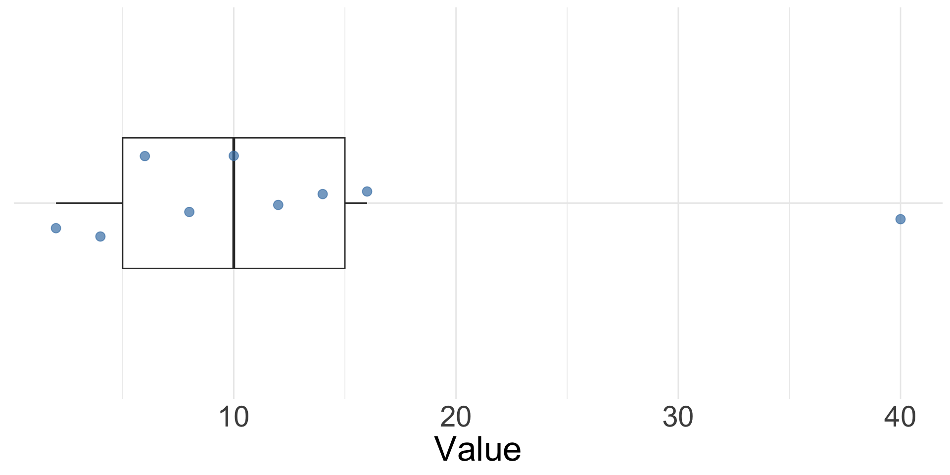
✏️ Using the quartiles you just found for 2, 4, 6, 8, 10, 12, 14, 16, 40 (\(Q_1=5\), \(Q_2=10\), \(Q_3=15\)), draw the box plot by hand.
Exercise: draw a box plot
✏️ Using the quartiles you just found for 2, 4, 6, 8, 10, 12, 14, 16, 40 (\(Q_1=5\), \(Q_2=10\), \(Q_3=15\)), draw the box plot by hand.
Exercise: solution
💡 Let’s see a solution!
\(Q_1\): 5
Median (\(Q_2\)): 10
\(Q_3\): 15
\(IQR = 15-5 = 10\)
\(Q_3 + 1.5 \times IQR = 15+15 = 30\)
40 is beyond that value, so it’s an outlier: the whisker stops at 16, the last value within \(1.5 \times IQR\) of the box
Exercise: interpreting boxplots
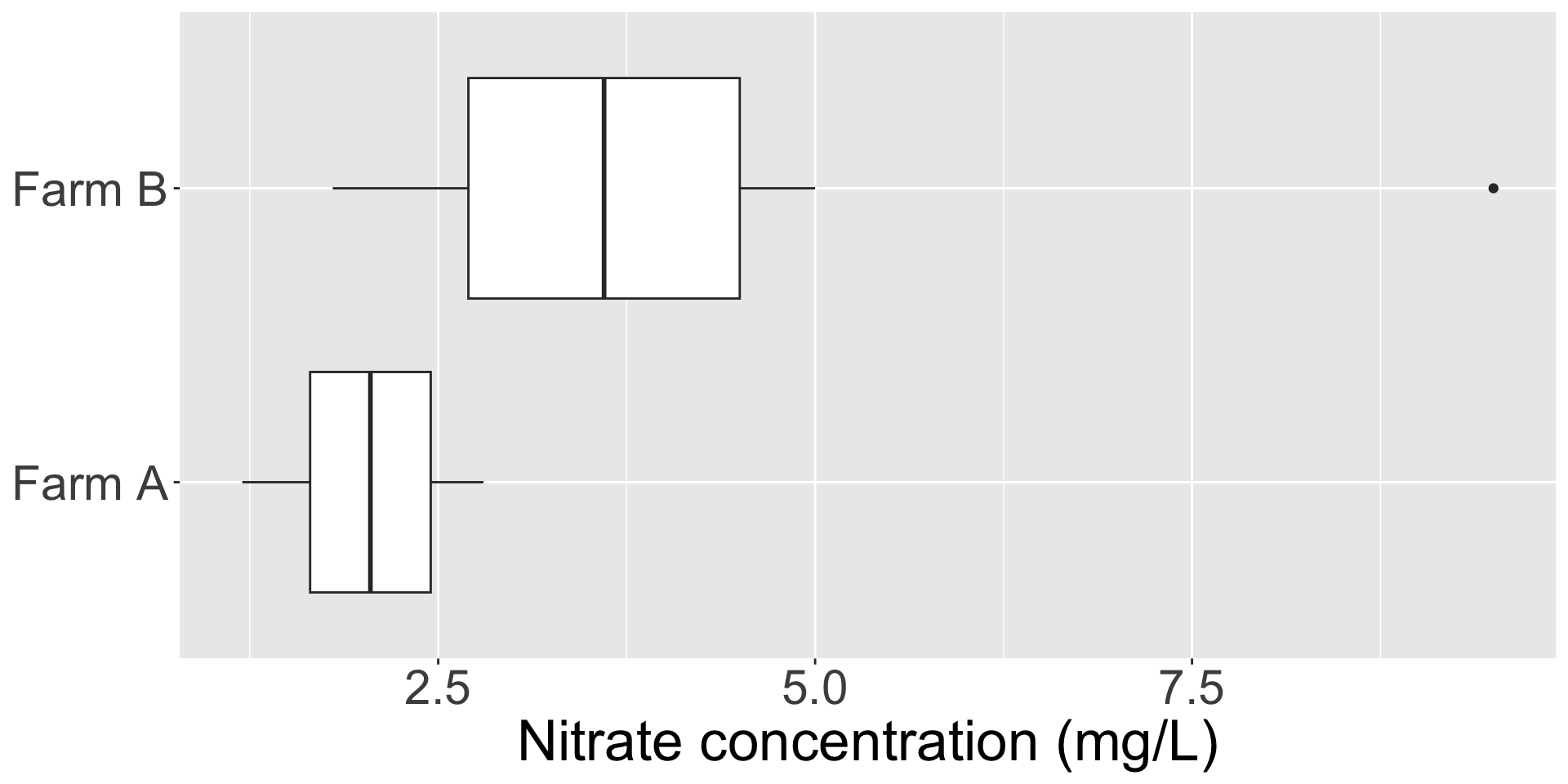
✏️ Two farms are monitored for nitrate concentration (mg/L) in their downstream runoff. Compare the two distributions below.
Which farm’s runoff has the higher median nitrate concentration?
Which farm’s readings are more spread out?
Is there anything unusual in either distribution?
Exercise: solution
💡 Let’s discuss!
Median: Farm B’s median (~3.6 mg/L) is noticeably higher than Farm A’s (~2.05 mg/L)
Spread: Farm B’s box and whiskers cover a much wider range, so its runoff is more variable
Outlier: Farm B has a high outlier at 9.5 mg/L, flagged because it falls more than 1.5×IQR above the 3rd quartile. This might be worth investigating.
Let’s take a 5 minute break
image: Flaticon.com
Summarizing data numerically
Summarizing data numerically
Central tendency
Variance and standard deviation
Standard error
Confidence interval (VERY IMPORTANT: tomorrow)
Median
Middle value when all observations are arranged in order. If you have an even number of values, the median is calculated as the average of the middle two values. E.g. \(median\;of\;3, 7, 17 = 7\)
Pros:
Less susceptible to skew and outliers
Cons:
Doesn’t take into account the magnitude of all values
Mean
Average value of sample observations, calculated by summing all observation values and dividing by the number of observations.
E.g. \(mean\;of\;3, 7, 17 = \frac{3+7+17}{3} = 9.\)
Pros:
Average value is often useful metric
Commonly reported
Cons:
Susceptible to outliers and skew
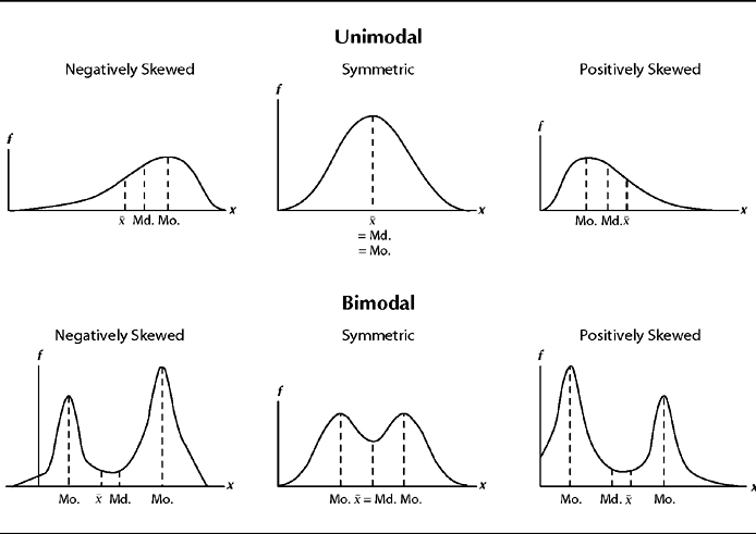
Subject to misinterpretation as “most likely value”
Mode
The most frequently occurring value(s) in a dataset.
Divide by the number of data points minus 1 (\(n\) - 1)
\[Variance = \frac{28}{5-1} = 7 \text{ units}^2\]
Standard deviation
Also a measure of data spread, calculated by taking the square root of the variance.
\[ s = \sqrt{\frac{\sum_{i=1}^n(x_i - \bar{x})^2}{n-1}}\]
Standard deviation is expressed in the same unit of measurement as the data, and therefore can be easier to interpret – for example it’s more intuitive to report that a group of people’s heights has a standard deviation of 3 inches, and less intuitive to report a variance of 9 square inches.
The best way to describe the distribution of the data is to present the data itself.
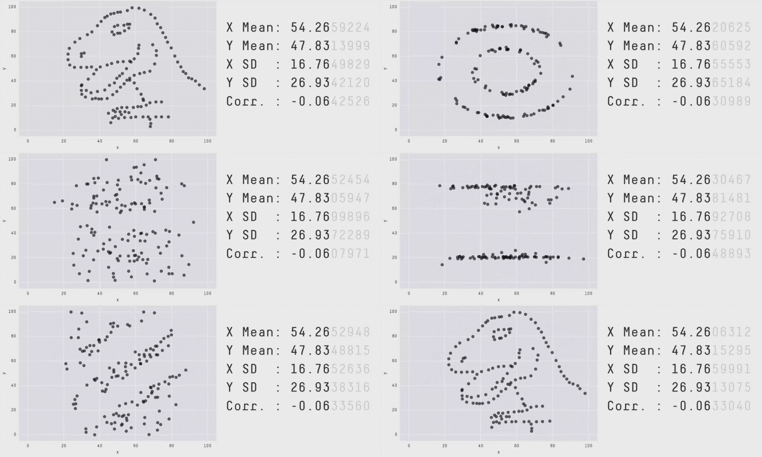
Beware summary statistics alone . . .
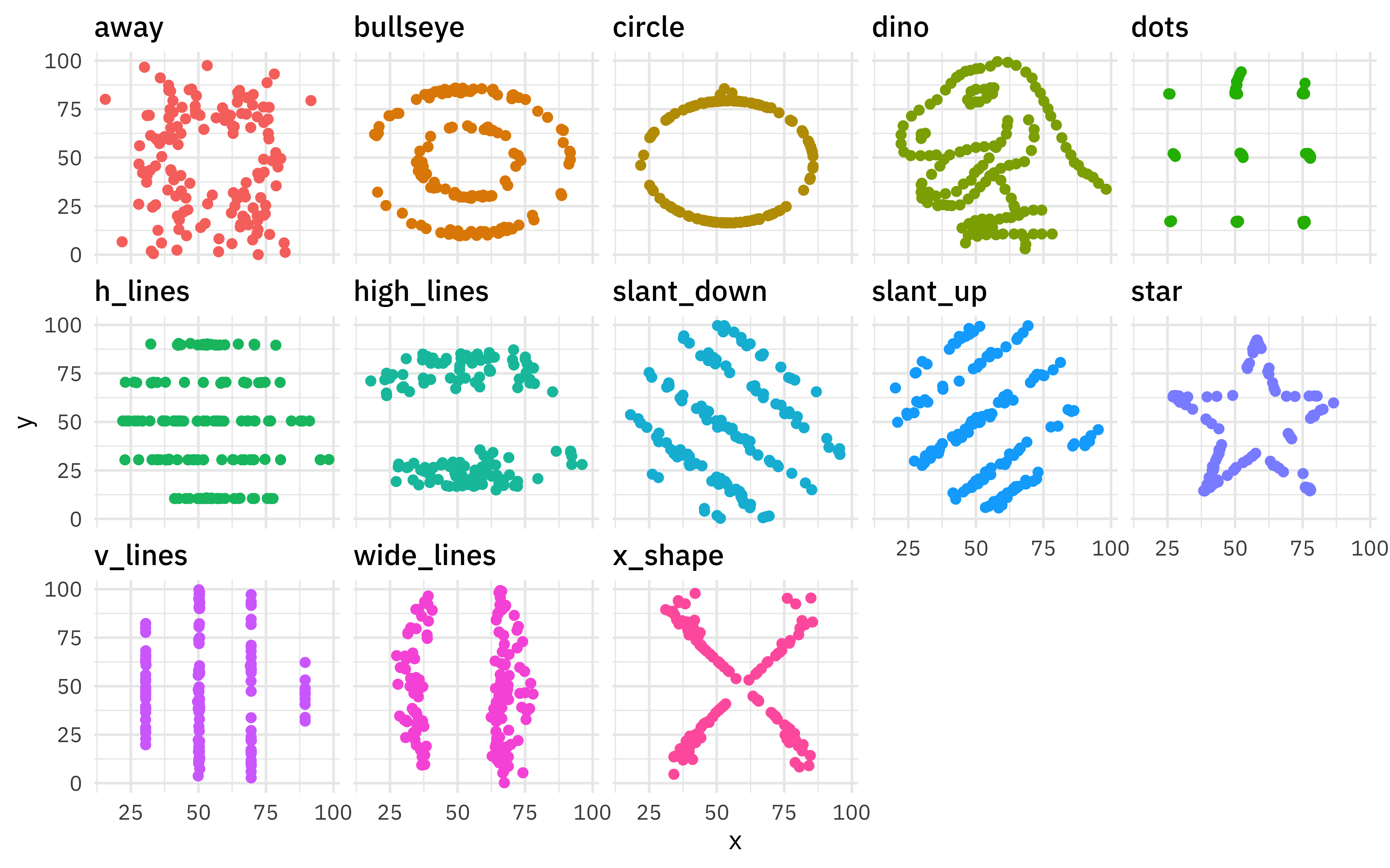
Meet the Datasaurus Dozen
Same summary statistics, different distributions
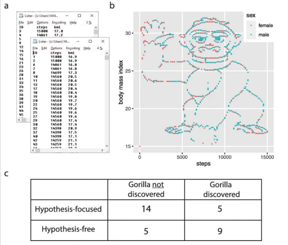
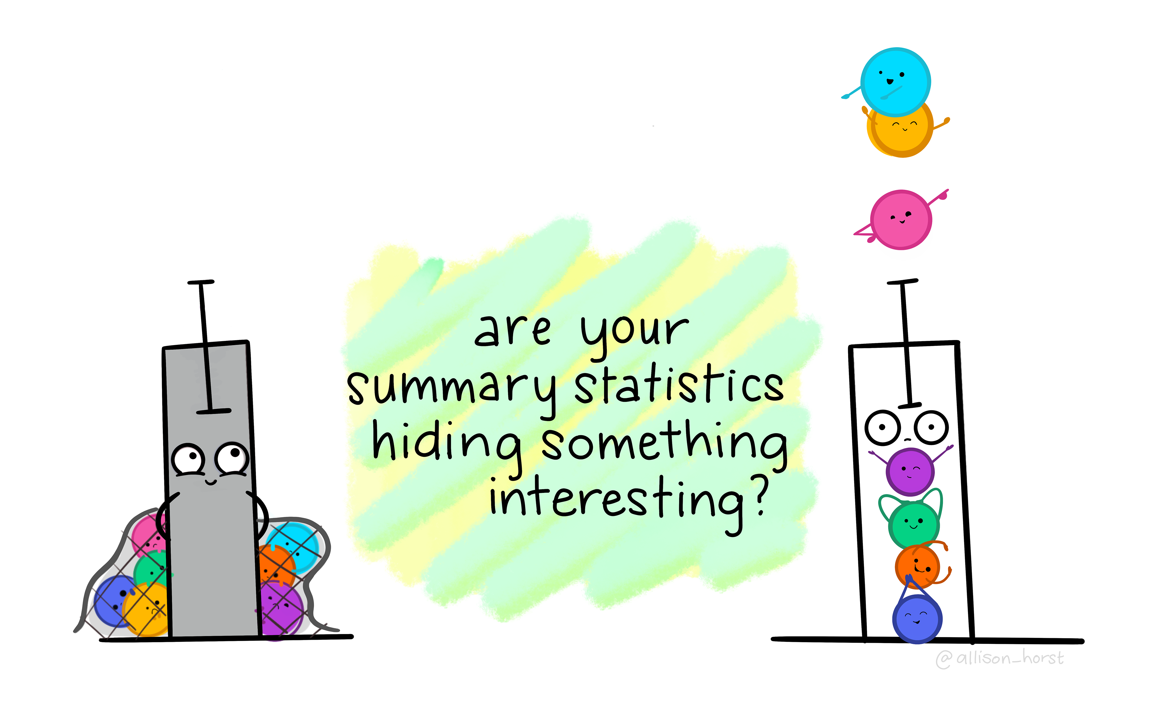
Is there something hidden in your data?
Study gave students a made-up dataset containing the BMI of 1786 people and the number of steps each took on a particular day.
Students in Group 1 were asked to consider three specific hypotheses + also if there was anything else they could conclude from the dataset.
Group 2 was simply asked, “What do you conclude from the dataset?”
If you plotted the number of steps vs. BMI, you’d find the gorilla. Students driven by hypotheses skipped this step more often than those that were not hypothesis-driven.